Sunday, June 14, 2015

WHAT WOMEN WERE READING IN 1981


I temporarily put down Mike Barrier's book on comics in order to finish two books that are due at the library this week. One is a sleazy but unintentionally funny womans novel called "Scandals," and the other is a scary non-fiction book about Putin's Russia called "Nothing Is True, Everything Is Possible."Here's (below) an excerpt from Scandals. See what you think. 

It starts with a nice house in Brentwood (above). Mona's husband is away on a business trip and she's invited her husband's young protege Peter Hamilton over for cocktails. It reads....

Absently Mona put the Perrier it her lips, swallowed and took a deep drag off the pall Mall. "You know, Peter, if it weren't for my bosom I think Jack would just walk out without saying 'Boo!' "
"No. Do you really think so?"
"Just ring that bell on the table, and I'll show you what I'm going to do to Mr. Jack Logan before we're finished."


Peter lifted the bell. Crystal chimes pealed and Wang hurried into the room.
"Wang," Mona commanded, "I want you to do your trick. Your trick, please, Wang...for Mr. Hamilton."


Wang hissed and bowed. He whirled back into the kitchen then reappeared carrying a long two-by-four. He put the piece of wood over a gap in the fireplace , nonchalantly stepped back, and then attacked.
Loosing a wild streak, Wang jumped forward and swung the heel of his hand in an arc. When hand met wood, the latter splintered, the two ends flying up in the air.
"Whew!" Peter said, "some trick."
"Wang," Mona said, clucking delightedly, "that was marvelous. Thank you ever so much. You see?" she asked Peter.

"But seriously," Peter said, "you'd never use that weapon on Jack Logan, would you?"
"I might. Peter, come in the pool."


He shook his head. "I should hit the road, Mona."
"Peter, you've got nothing to do. Come on in the pool. You look all hot and bothered." She winked at him. "It's me, I know. I give off a sexual discharge." Her nose twitched. "Electrical, I mean."
He could not disagree. Mona, possibly excited by Wang's show of force, had become a nimbus, prepared to swallow the whole world of men.

........................

Wow! Mona became a "nimbus," whatever that is. And the names...MOANa, Peter, Wang...I can't believe the writer did that. And the Mona character actually retains a salaried tough guy to keep her husband in line. Unbelievable! Someone should do a book about what housewives were reading in this period!

Hmmmmm....it looks like I don't have room to talk about the Russian book. Oh, well...next time!

"TALES OF WORM PARANOIA": DRAWINGS THAT DIDN'T MAKE IT TO THE SCREEN


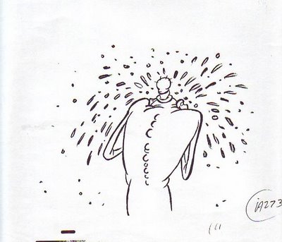
This (above) is from a deleted scene where Sally finally realizes what the Worm's intentions are. I did the sketch and Tuck Tucker did a genius job on the clean-up. The scene was deleted for time.


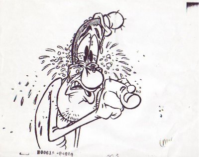
These last two drawings are inbetweens from the brilliant animation Glenn Kennedy did on the Worm addressing the audience in the beginning of the film. He had great teardrop theories and a beautiful, cartoony line that made me regret the necessity to color the scene.

The originals of the drawings you see here, along with a bunch of others, were stolen from the studio before they could be copied. Glenn was able to do the missing parts over again, and he did a great job, but I still preferred the first drawings. Here's (above and below) a couple of originals that the audience never saw.


Wednesday, June 10, 2015

SIDESHOW BANNERS

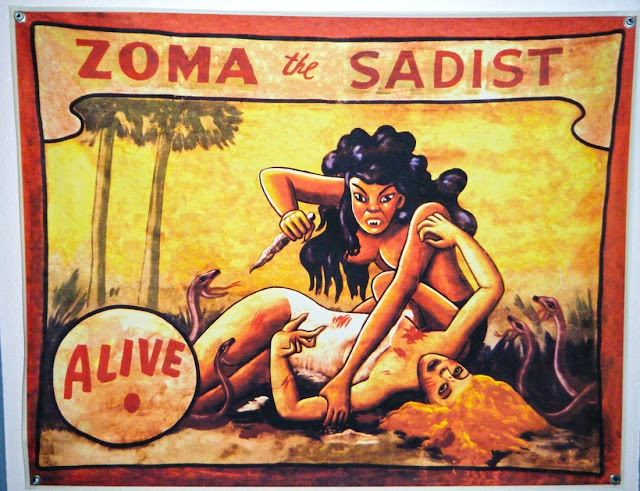
Don't you love sideshow banners? Half the time they're better than the exhibits they promote.
Compare the old-time banner at the top to the recently made one above. Is it just me or are these later graphics too slick, too dependent on the lettering?


They're clearly influenced by underground comics.


Some of the newer banners (above) are even influenced by manga.


I liked carnival banners better when they were made by ex-sign painters who could draw human figures, but just barely.

n
I like the way the old banners were executed on canvas with what looks like thinned house paint. The lettering was deliberately understated.

I like the way the thin man is caricatured in this picture. The man is suave. He's proud to be skinny.


 By way of comparison, the banner above is too realistic. The fat girl looks too much like a real fat person. Her weight doesn't suggest any entertainment value.


This (above) is more like it. The proportions are deliberately caricatured and unrealistic. This girl's fat and proud. She feels sorry for you because you aren't fat.

On the other hand, maybe the real girl actually looked like that. It strikes me that when I was a little kid I actually saw someone like that. Maybe carnival fat people used to be a breed apart in that they had different proportions than most fat people. Maybe the professionally fat, the people who made their living at it, knew how to cultivate a silhouette like the one in the picture above.


Anyway, the myth persists that carnival artists can't draw. That's not true.  If they couldn't you'd get banners like the one above, which wouldn't be useful to anybody.


I said banner artists could only just barely draw, but I take that back. They were actually pretty skilled, but in a style that was self-effacing and came from a folk art tradition. 


It's funny how every medium that's been around for a while develops a style that fits it like a glove. By way of an example, here's (above) the familiar "X-Ray Specs" which used to be widely advertised. If the illustration above had been used for an ad I don't think it would have sold the product very well. It's too sophisticated. You can't sell a lowbrow product with highbrow graphics.


On the other hand, this badly-drawn art (above) wouldn't do the job either. It makes the product look shoddy and the seller seem untrustworthy.


Here's (above) the perfect compromise, the one that caught on with the public. The principals of art are observed but the artist still comes off as primitive. He projects the image of a trickster, a joke teller; someone who's not above using the product himself.

You won't realize how good the original artist was until you compare what he did with later artists (above) who tried the same thing. The later artists couldn't create an iconic image. Drawing iconic is a rare and under-rated skill. I wish I could take lessons from somebody who knows how.


The later X-Ray Spec artists were eventually dumped in favor of the original artist and new art (above) was commissioned. It was iconic but the old pizazz was gone. The original art caught the artist at his dazzling apex. What catastrophe happened to him afterward? Alcoholism? Alimony? Disillusionment? Formal art education? I don't know.


So what am I getting at here? 'Just the notion that the style of art should fit the unique medium the art is created for.


Monday, June 08, 2015

DISNEYLAND ARCHITECTURE

One of the things I do at Disneyland is look for ideas I can adapt to my own house. I could easily spend a profitable day just looking at the ironwork on fences or the doorknobs on dungeon doors. I was there this weekend but my camera was on the fritz and I didn't get too many useful photos. That's okay. I'll supplement my own pictures with ones from the net.

Here they are. See what you think.


Here's (above) the Small World facade, beautifully designed by Mary Blair. Geez, with foam core and an exacto I could make a miniature facade of my own design for....no, wait a minute. That would probably be more trouble than it looks.


Above, nice vintage explorer photos in the Indiana Jones ride.


Old explorer photos would be great additions for the wall of a boys room...or a guest room that looks like a boys room. Add to this Bill Peet layout a nice map and maybe a fish tank and a Navajo rug...Wow, it would be a kid Paradise.


Here's some interesting lamps from Disneyland's Mexican restaurant. I wonder if this type of lamp would work in my house? I'm not sure.


And talking about lamps, how do you like these rice paper lanterns over the Teacup ride? I notice that blue dominates, red and purple are secondary and yellow is only an accent.   If I ever throw a party in my back yard I'll know what to reference.


Here's (above) how architect Cliff May designed a room for a client who had a paper lamp collection. He made the walls brown so the yellow lamps would read better.


I get a million ideas for garage rafters (above) at Disneyland.


And all the Alpine ideas at the Park! They're endless!


Haw! I'd like to embellish my back fence with artifacts like these (above), from Adventureland. I wonder what my neighbors would say?

Friday, June 05, 2015

FROM MY FAMILY SCRAPBOOK

Here's a few pictures of family and friends but I can't identify anyone because I don't think they'd want me to. That's me above, together with an acrylic portrait done by a friend I haven't seen in ages. Haw! I had to crop the photo because he gave the painting a gut the size of a wrecking ball.


When my family visits we usually go to an art museum.


BTW: Isn't Photoshop amazing? That yellow face on the left of the museum photo was facing forward when I found it on the net and I used Photoshop to warp it into a profile.


I'm dying to name names, but I'd better not.


My Captain Hook mask feels like family, thus it has a place in the family file. It's sadly decaying now. I had to put on glasses to cover up chipping in the eyes.


Here's (above) me with a friend of a friend. I don't know this person very well but if you're a female in a bikini and your arm is around me then you definitely rate a place in my scrapbook.

Here's (above) an illustration for a book about horses by a namesake. Gee, my namesake wasn't very good at spacing his letters.


When I first met John this (above) was his favorite pizza restaurant. I think he just liked the menu cover, which I have to admit was a work of art. I offered to buy it and the owner gave it to me for nothing. I think I'll frame it.
That restaurant also sticks in my mind because it was filled to the gills with plastic fruit and artificial vines with bar-code labels. All the vines stood straight up because the owner regarded them as so beautiful when new that he couldn't bring himself to bend them.


By the way: congrats to all the graduates out there! You made it!!!!!!! For you I reprise "Gaudeamus Igitor" from YouTube. It's the traditional academic anthem from medieval Europe. Youtube has other translated versions but I think you'll especially appreciate this one. Congratulations!!!!!!!!!!!!!!

Thursday, June 04, 2015

THE LATEST ASTRONOMICAL PICTURES 6/2015

This (above) should get an award for the best astronomy photo of the year. It's a jagged cliff looming over a gravel foreground on the comet Churyumov-Gerasimenko. The part of the cliff we see in this picture is 850 meters wide.


Here's (above) Saturn's moon, Hyperion. Despite its 250 kilometer size, the spongey moon exerted very little gravitational pull on the probe that took the picture. It's mostly hollow inside, in the way that a sponge is hollow. The oddly-shaped craters are thought to be that way because the impacts that created them threw the ejecta into space rather than compacting it into the surface.


Here's (above) a creepy picture that's generating a lot of controversy. The star on the lower left is a supernova first seen a few weeks ago near the disk galaxy it seems to be associated with.

Calculations of the star's distance and brightness have led some to conclude that the great majority of energy in the universe is contained in the fabric of space itself, and not in galaxies and stars.


These computer-generated pictures show Pluto's moon "Nix" tumbling wildly around the common center of the double planetoid, Pluto/Charon. We'll know more about this in a month when NASA's Pluto probe passes these bodies.

Wednesday, June 03, 2015

MORE RANDOM EDDIE SKETCHES

Here's some idea sketches I did for various projects I worked on.

Haw! I like the idea of an inventor who's harried by his own inventions. Here Igor tries to impress his master by making everything user friendly, and then has to live with the consequences.


This (above) is an excerpt from something I did for Theory Corner. Normally I can't draw John but for some reason I don't have any trouble doing continuity about him. Maybe that's the secret of caricaturing hard to draw people...you do a comic about them and a different part of your brain kicks in.


Here's (above) a sketch from another strip. How do you like the short bell bottoms John's wearing? He doesn't really dress like that but he used to draw other people that way and I picked it up from him.

Here's (below) a fragment of a different continuity, also for Theory Corner. It's about an acting class exercize....


...well, it went on for a couple more pages. This reminds me that I seriously considered taking acting classes at one time. I didn't want to be an actor, I just wanted to see if doing that would make me a better storyboarder. I didn't end up doing it because I became interested in something else instead...stage movement.

By that I mean how an actor sits, walks, gestures, enters and exits and relates to other actors. There used to be lots of acting coaches who taught this sort of thing but they're a rarity now. I couldn't find one, and I live near Hollywood for Pete's sake!

I had to learn stage movement on my own, being mindful of the maxim that says "The man who teaches himself is taught by a fool."